The best logos withstand the test of time. But even the market leaders like Apple and Coca-Cola need a refresh from time to time. Here’s some fun animations from Wonkblog that show how the logos of leading companies have changed.
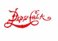
1. The Pepsi brand has had a long time to evolve: Born as “Brad’s Drink” in New Bern, North Carolina, Pepsi-Cola became an official trademark in 1902. In 2008 the logo was tweaked so the white stripe runs diagonally, a marketing move that reportedly cost the company several hundred million dollars.
2. Coca-Cola got its name because one of its inventors thought that “the two Cs would look well in advertising.” The company added the white “wave” in 1969.
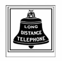
3. AT&T was originally a subsidiary of Alexander Graham Bell’s original Bell Telephone company, hence the bell in its first 1889 logo. In 1983, AT&T split from its regional phone companies as a result of an anti-trust lawsuit. One of them became Southwestern Bell, which retained the bell in its logo, and AT&T rebranded with a globe circled by electronic communications.
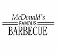
4. The first McDonald’s Bar-B-Q restaurant, a drive-in with a car-hop service, opened in San Bernardino, Calif., in 1940. The arches were created in the early 1950s, when the company constructed a new restaurant with two 25-foot yellow arches to attract more customers. They were incorporated into the logo in the 1960s.
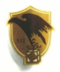
5. UPS’s logo has only had four iterations since the company was founded in 1907. The first 1919 logo featured an eagle carrying a package. In 1937 it was updated to a shield, and in 1961 it became a shield with a package. The company rebranded in 2003 to emphasize that they are no longer just a package delivery company.
6. Walmart launched in 1962 without a true logo, and then adopted a “frontier font” in 1964, which it used for nearly 20 years. In 1981, the company dropped the frontier font for a cleaner look, and in 1992 the hyphen was replaced with a star. The newest logo with a spark rolled out in 2008.

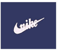
7. The Nike swoosh, perhaps the most iconic of all corporate logos, was first used in 1971. It was designed to convey the idea of motion and fit comfortably on the side of a shoe. The graphic design student who created the swoosh waspaid just $35 for the work.
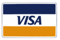
8. Visa’s original gold and blue logo represented the golden hills and blue skies of California, where its original parent company Bank of America was based. The gold in the logo name ultimately disappeared in early 2014.
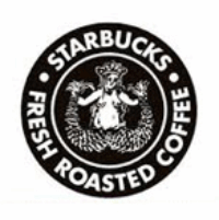
9. Starbucks designed its first logo in 1971 to feature a twin-tailed mermaid called the Siren. One of the founders saw a 16th Century Norse woodcut of the Siren in an old marine book, and thought she was a fitting representation of the seafaring history of both coffee and Seattle, where Starbucks was born.
10. For a relatively young company, Microsoft’s logo has gone through a lot of iterations, from a vaguely disco-inspired logo in 1975, to a “Pac-Man Logo” in 1987 that had a slash in the 0, and finally to the multi-colored windows.

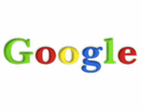
11. Sergey Brin reportedly designed the first logo Google logo in 1998 with open source image editing suite GIMP. The company briefly added an exclamation point in 1999 before landing on the nicely simple serified font it has today. According to the designer, the primary colors don’t follow an ordered pattern to show that “Google doesn’t follow the rules.”
12. There are lots of stories out there about the Apple logo: That it refers to Adam and Eve, or the cyanide-laced apple that killed the inventor of the modern computer, Alan Turing. But the truth appears to be much simpler: Steve Jobs worked in apple orchards in Oregon. He wanted a simple and easy name for his brand, and ended up naming the company and its computer after his favorite brand of apples, McIntosh.
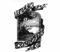
Apple’s original logo from 1976 features a hand-drawn image of Isaac Newton under the tree, with an apple dangling precariously over his head, surrounded by the words “A Mind Forever Voyaging Through Strange Seas of Thought — Alone.” That super-nerdy image quickly evolved into the simplified apple with the bite out of the side. The story there isn’t too complex, either: According to the logo’s creator, the bite is basically there for scale, so you can tell it’s an apple and not a cherry.
Much of the information for this post originally appeared on Wonkblog, written by Ana Swanson. Anna is a reporter for Wonkblog specializing in business, economics, data visualization and China. She also works on Know More, Wonkblog’s social media channel. The original article can be read here.